01
The word orange
Find "orange" in blurry red letters left of center, set among red and blue strokes. The word names a color, but it is printed in a different one, so what you read and what you see do not match.
1 of 4 on the painting
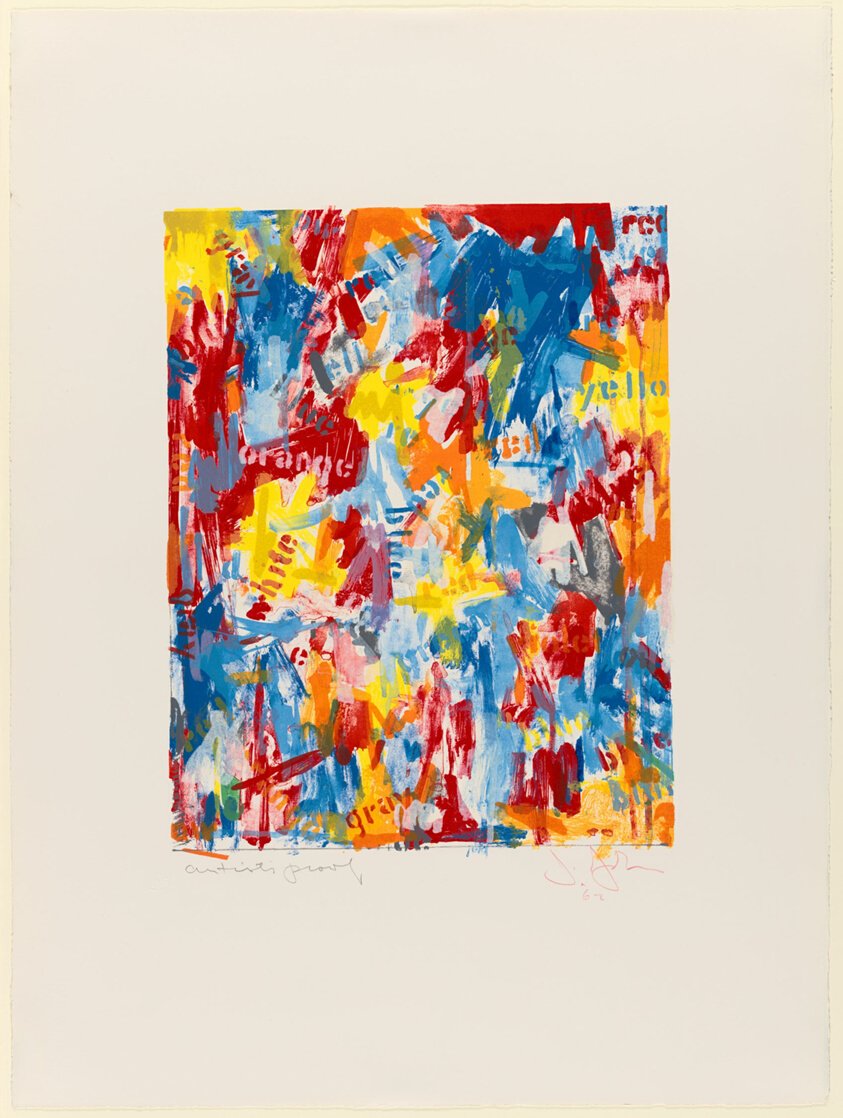
“Stop to appreciate how this vibrant lithograph plays with your perception, using mismatched words and colors to challenge what you see and read. It's a clever "false start" for your eyes and mind.”
This lithograph, "False Start I," pulsates with an energetic interplay of color and text. Bright, almost neon hues of red, yellow, blue, and orange are layered and brushed across the ivory paper, creating a dynamic surface. Words like "RED," "YELLOW," and "BLUE" are stenciled or hand-painted directly onto these vibrant fields, but often the word doesn't match the color it describes. For instance, the word "RED" might appear over a patch of blue, challenging our automatic associations and drawing attention to the act of seeing and naming. This playful disjunction, characteristic of the Neo-Dada movement, forces a viewer to actively engage with the visual and linguistic information, rather than passively absorb it. The deliberate "false start" suggested by the title hints at a disruption of expectations, inviting a fresh look at familiar elements.
Five details hide in plain sight. Pick one and we’ll show you exactly where to look.
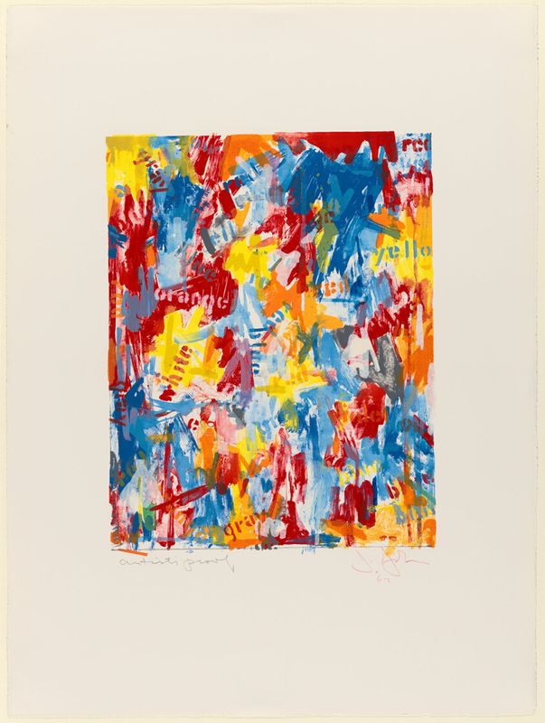
Find "orange" in blurry red letters left of center, set among red and blue strokes. The word names a color, but it is printed in a different one, so what you read and what you see do not match.
At the right edge, "yello" is cut off in orange letters over yellow. The final letter is trimmed away, so the lettering feels like part of a larger field.
Red, yellow, blue and orange overlap into pinks, greens and grays where layers meet. Each color was printed in turn, and the overlaps show how the image was built up.
In the upper right, broad blue strokes show streaky, ragged edges that look like wet brushwork. The print is a lithograph, so these gestures were translated into layers of flat ink.
Below the image, a pencil note at left reads like "artist's proof," and a pink signature with the date sits at right. These marks are the artist's handwritten additions to the sheet.
The full narration walks you through False Start I — the story behind it, the details most visitors miss, and why it matters. Free in the Art Whisper app.
Jasper Johns redefined American art by painting everyday objects like flags and targets, challenging perceptions of art and representation.
Beyond Johns and Postmodernism: works from the same years.
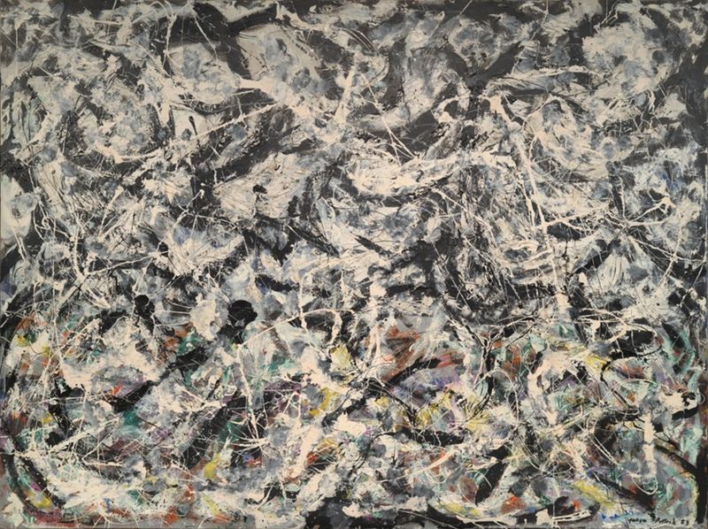 Same era · 1940s–1970s
Greyed Rainbow
Jackson Pollock · 1953 · Art Institute of Chicago
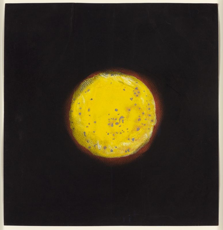 Same era · 1940s–1970s
Sun Spot
Yayoi Kusama · 1953 · Art Institute of Chicago
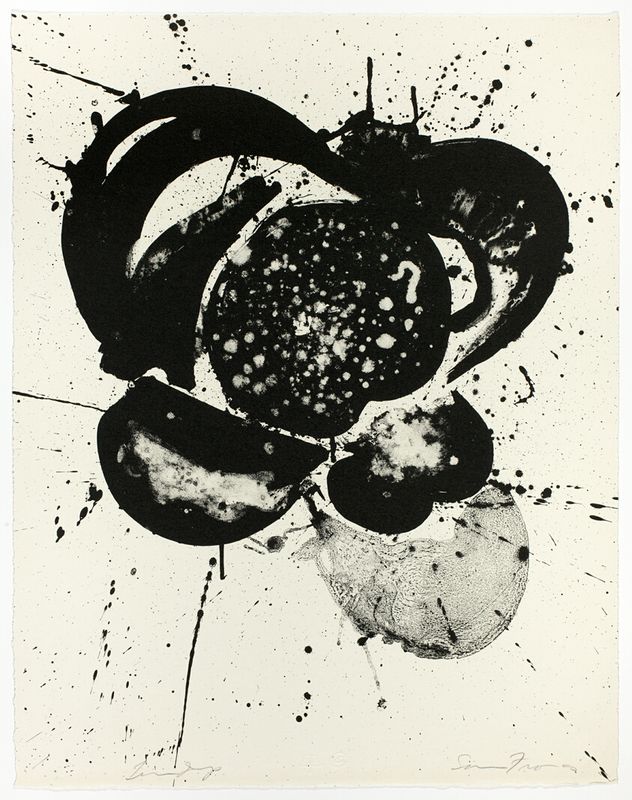 Same era · 1940s–1970s
Essai
Sam Francis · 1963 · Art Institute of Chicago
 Same era · 1940s–1970s
La grande bellezza
Pierre Alechinsky · 1965
 Same era · 1940s–1970s
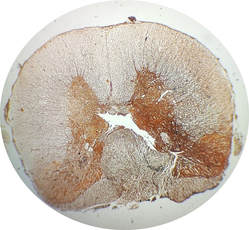
Impregnazione
Piero Manzoni · 1958
 Same era · 1940s–1970s
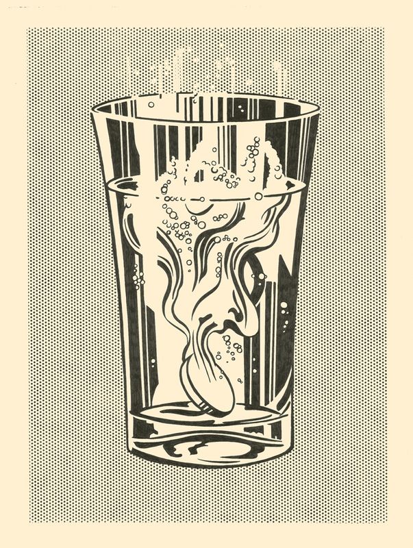
Alka Seltzer
Roy Lichtenstein · 1966 · Art Institute of Chicago
 Same era · 1940s–1970s
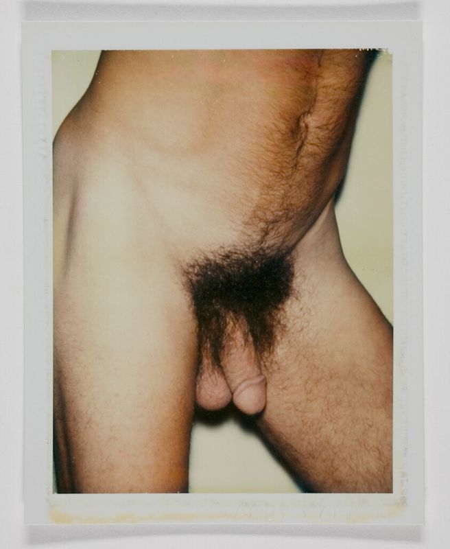
Nude Model (Male)
Andy Warhol · 1977 · Art Institute of Chicago
 Same era · 1940s–1970s
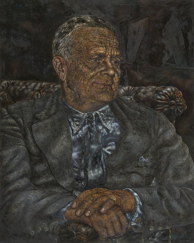
Captain Joseph Medill Patterson
Ivan Puni · 1962 · Art Institute of Chicago
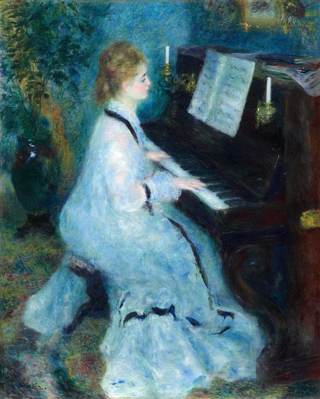 Same era · 1940s–1970s
Woman at the Piano
Philip Evergood · 1955 · Smithsonian American Art Museum
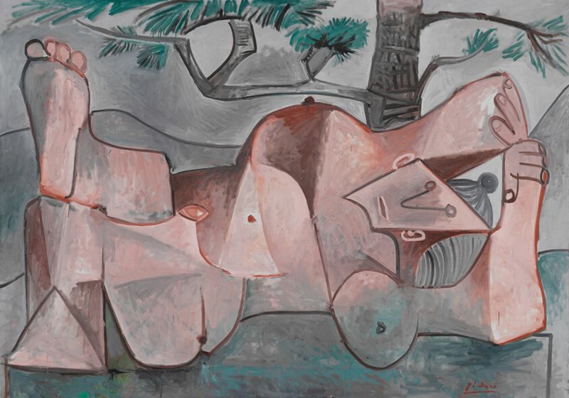 Same era · 1940s–1970s
Nude under a Pine Tree
Pablo Picasso · 1959 · Art Institute of Chicago
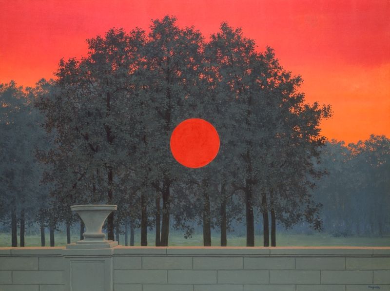 Same era · 1940s–1970s
The Banquet
René Magritte · 1958 · Art Institute of Chicago
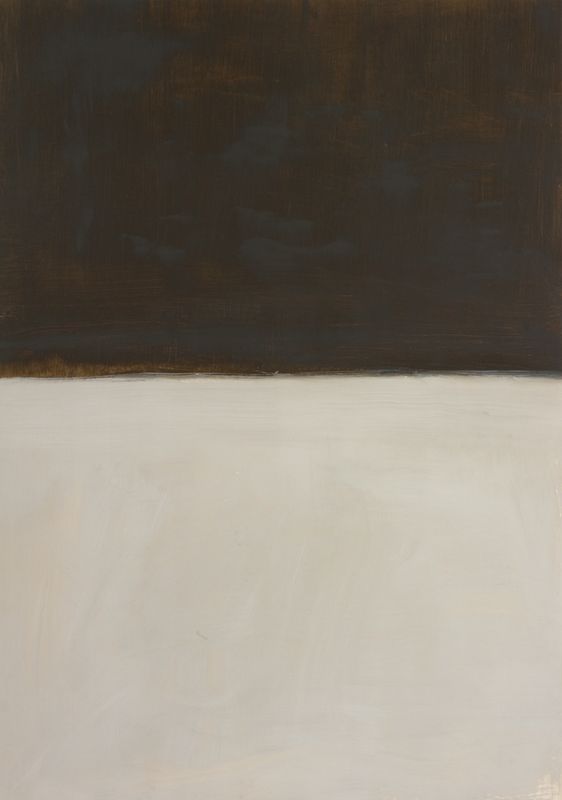 Same era · 1940s–1970s
Untitled (Brown and Gray)
Mark Rothko · 1969 · The Metropolitan Museum of Art